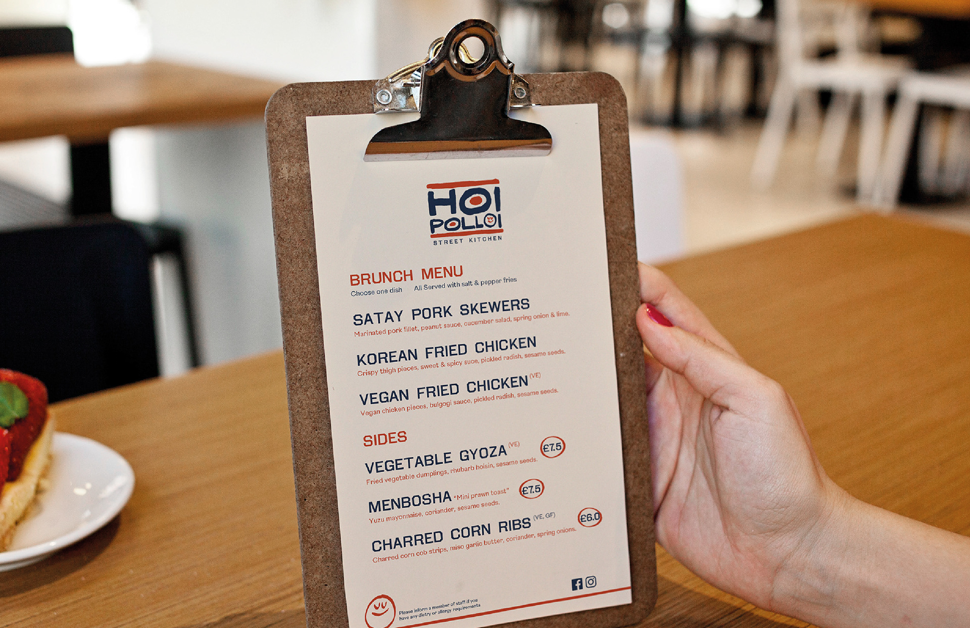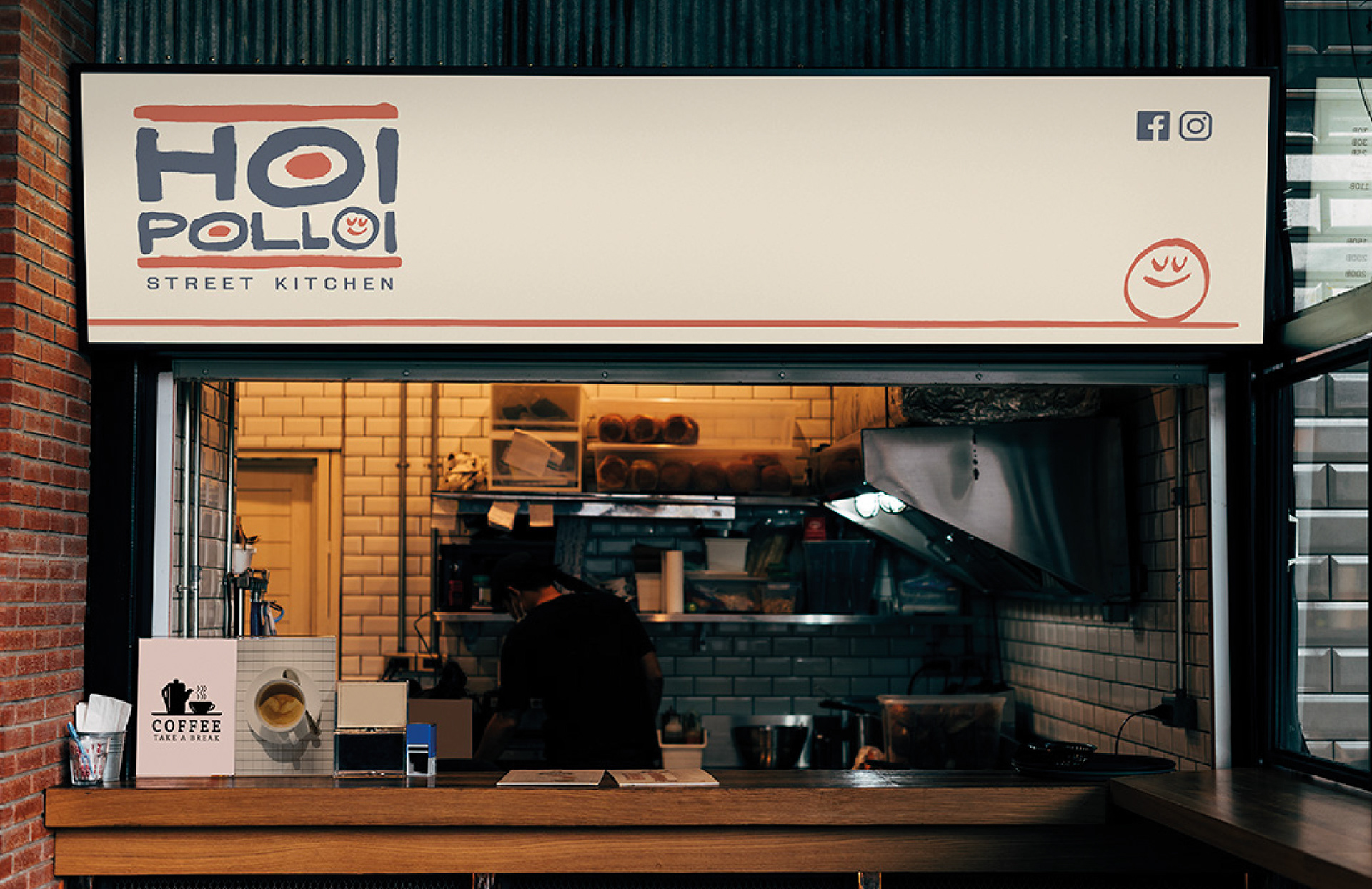
Hoi Polloi are a street kitchen that move from venue to venue, either taking up residency in bars and pubs, joining food festivals and catering private events. They came to us wanting a lively rebrand to help them stand out against the crowd of street food vendors that have become increasingly popular in the last few years.
Hoi polloi is an expression from Greek that means "the many" or, in the strictest sense, "the people" so the team wanted their branding to be friendly and approachable. They were inspired by street signage on a trip to Asia and were interested in exploring the use of a mascot or character.
.
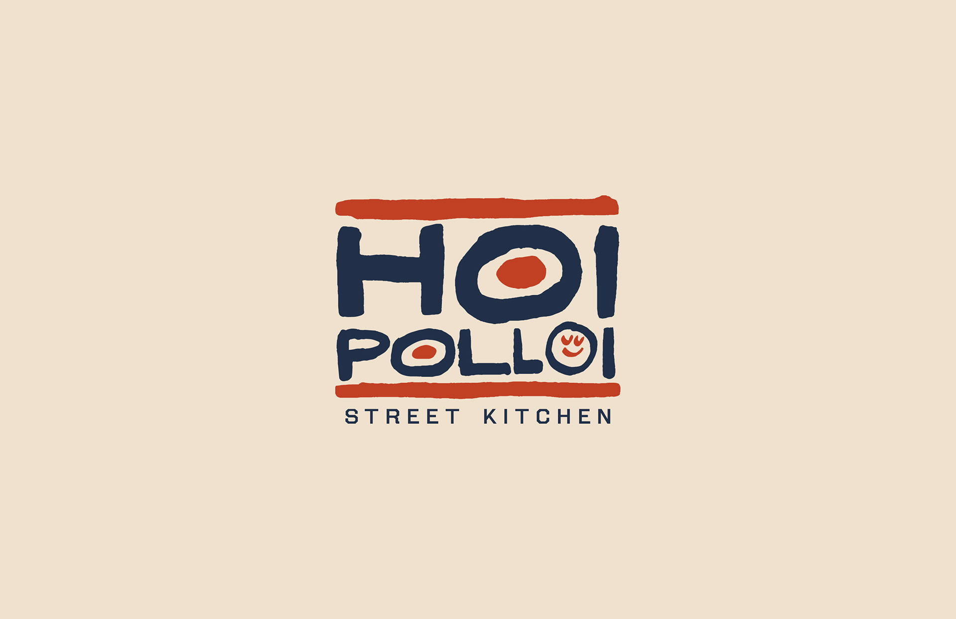
One element that inspired us on this project was the random shapes of sauce and food splodges. The visual idea was diluted a bit as the project went on, but many of the initial character drawings started with a bottle of sauce, and the rough edges plus stroke variation of those initial drawings can still be seen in the final logos. After various iterations of standalone logotypes with a range of mascots we opted to combine the hand drawn, splodgy lettering with a friendly, content (and full of tasty food) smiley face. The main lettering is inspired by the naive hand drawn signage found all over the world and is paired with a clear, bold and modern type.
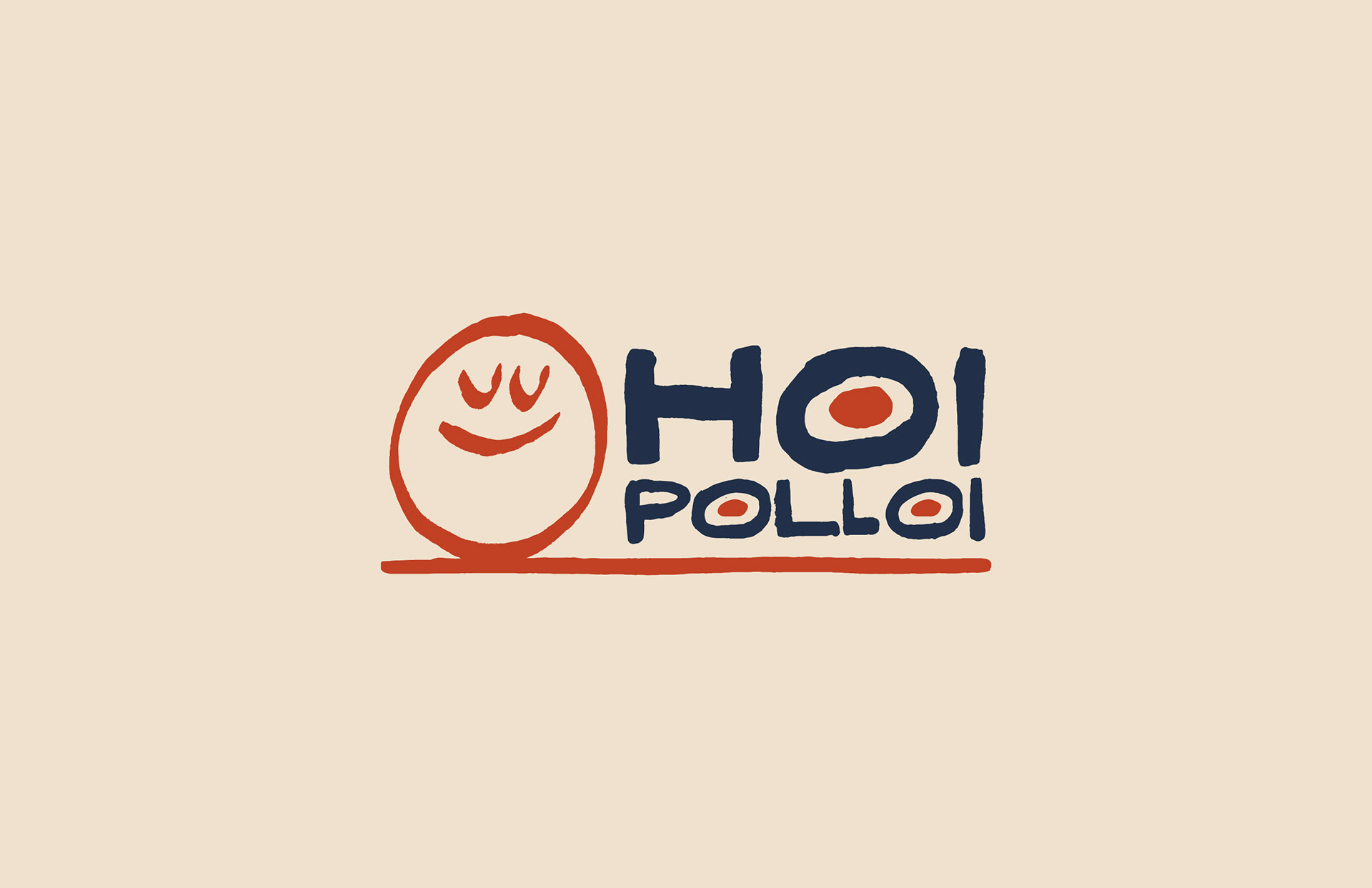
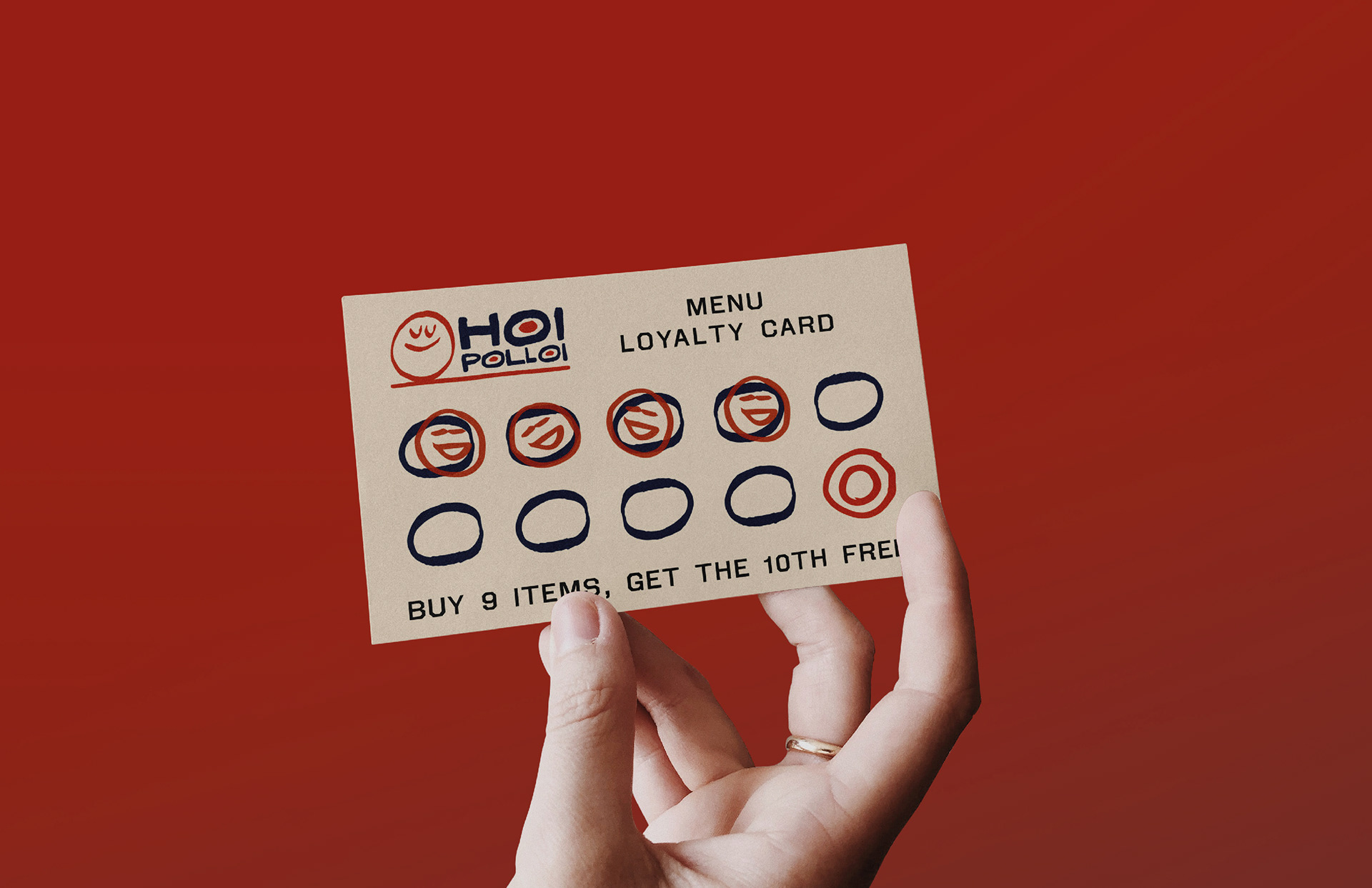
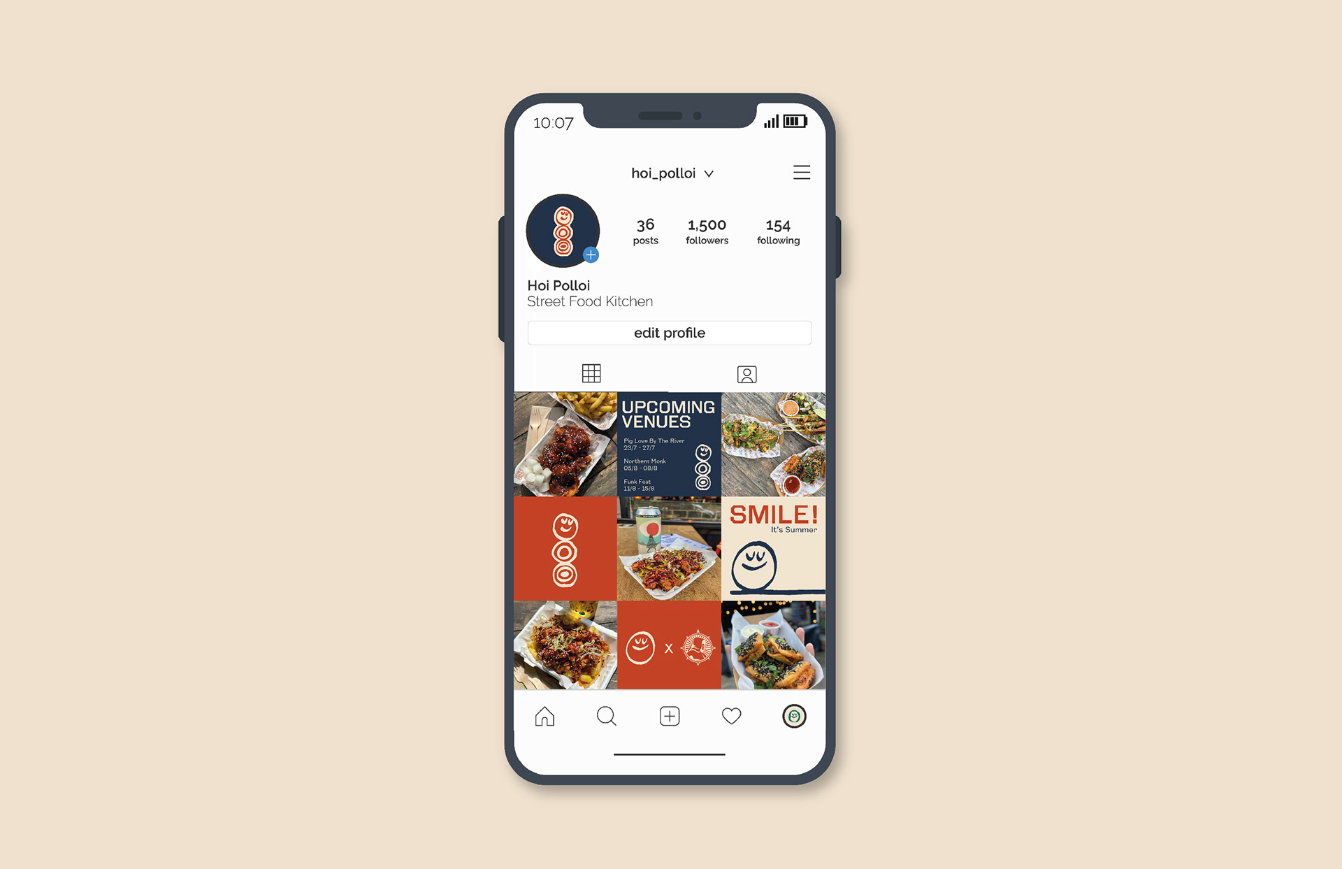
After deciding on a visual direction, the team at Hoi Polloi liked the idea of slightly varying logos to use across different applications. Here we have extracted the content smiley to it can be used either by itself at any size or along side the hand drawn lettering.
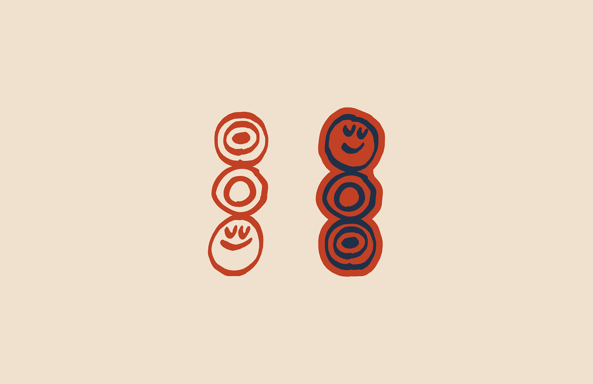
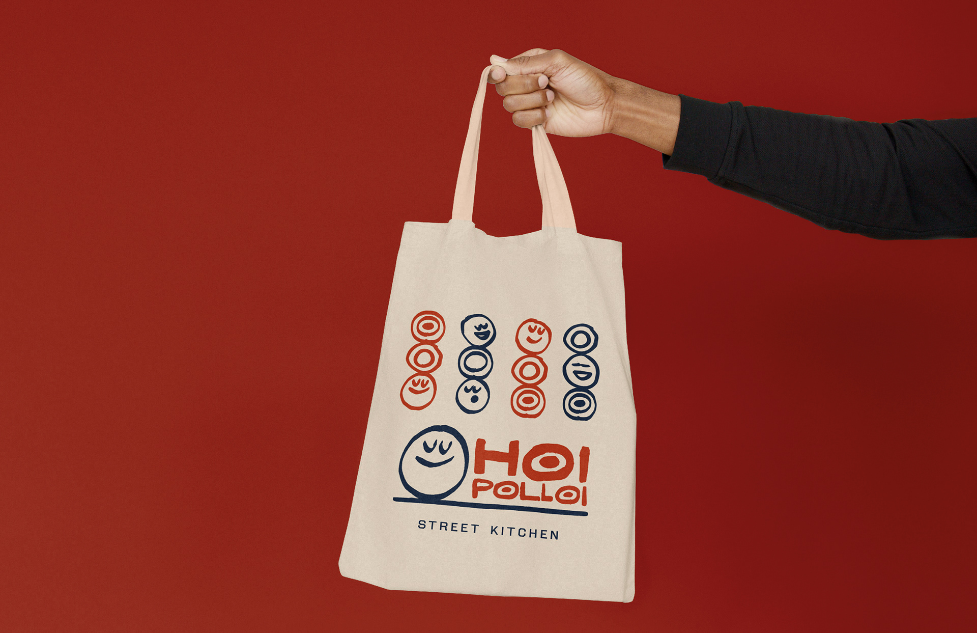
Using the content smiley faces and the “O” shapes from the logo we also created a series of stacked mascots showing various happy faces sat with plates of tasty street food. The client liked the idea of a vertical proportioned logo that they could use across social media and T-shirts etc.
.